Corporate Spending Innovations. CSI then. CSI now.
Deciding to rebrand a company is a huge undertaking with no guarantees that it will deliver desirable results. There are many things to consider, especially when your brand is already resonating with clients and partners and has been for nearly three decades.
At CSI we’ve always embraced the evolution of technology and the necessity of innovation as a means of staying ahead of the curve. It’s ingrained in our culture. Our name has always included CSI, and our history demonstrates this when you look at the myriad of iterations our brand has taken since our inception in 1989.
We began as CSI Enterprises, Inc. tackling tractor trailer leasing and then global-fleet fuel cards. Virtual credit cards followed with our globalVCard product and soon our brand took on its own identity as CSI globalVCard. globalVCard shined in the spotlight for years as the epitome of our brand, while the meaning of CSI seemingly became lost to the public.
Although the positioning of globalVCard served us well over the years, the limitations became more evident as our company and product suite continued to grow beyond virtual cards.
MAKING THE DECISION TO REBRAND
Who We Were
Our leadership team took a deep dive into what our company name and logo really meant to us and to our clients. We analyzed how we do business, how we’re currently positioned, and where we wanted the future of our industry and company to go.
We recognized the confusion that surrounded our brand, especially among those unfamiliar with the industry, looking to us for answers. Instead of answering questions that would demonstrate our savvy in a complex industry, we were getting questions like, “Does CSI stand for Crime Scene Investigation?” and “What is a globalVCard?”.
The company was CSI Enterprises, Inc. and the product was globalVCard, but we had become more.
Who We Are
We are now a global FinTech leader with a fully integrated accounts payable platform, corporate travel payments solution, and partnership opportunities across industry verticals and financial institutions.
We are developing new technology in-house and keeping open dialogues with partners and clients to support continued evolution and innovation of our payment products.
The Executive and Marketing teams agreed, we needed a name that would tell our full story, a website that laid out clear messaging, and a brand image with universal appeal to represent our overarching values and commitment to the industry.
With that, we went to work to develop the next evolution of the legacy of our organization.
THE PROCESS – SUCCESSES AND CHALLENGES
The Creative Process
Everything begins with the creative process and our marketing team asked all the right questions. What’s in a timeless logo? What defines our company now? What should define our company in the future? How do we appeal to an international audience that will include younger disruptive FinTechs as well as more conservative financial institutions?
The Name
We needed to define what makes us unique, and what our key attributes are as an organization. The consensus was that we are global, industry-leading, dynamic, progressive, innovative, trustworthy, authentic, dynamic, and nimble.
We also boiled everything down to the bare bones of what we felt our brand should ultimately and indefinitely project, which is strength, trust, leadership, credibility, knowledge, and support.
Corporate Spending Innovations is who we have always been, and it is clearly who we still are. So, we made the simple decision to drop globalVCard from our name.
The Logo
Despite the simplicity behind the decision of eliminating globalVCard from the brand image, there were still a few roadblocks with early logo concepts. We wanted to be very unique and we had to take into account many other FinTech companies in the space. That meant an extensive due diligence process was required to vet out any new design and color choices.
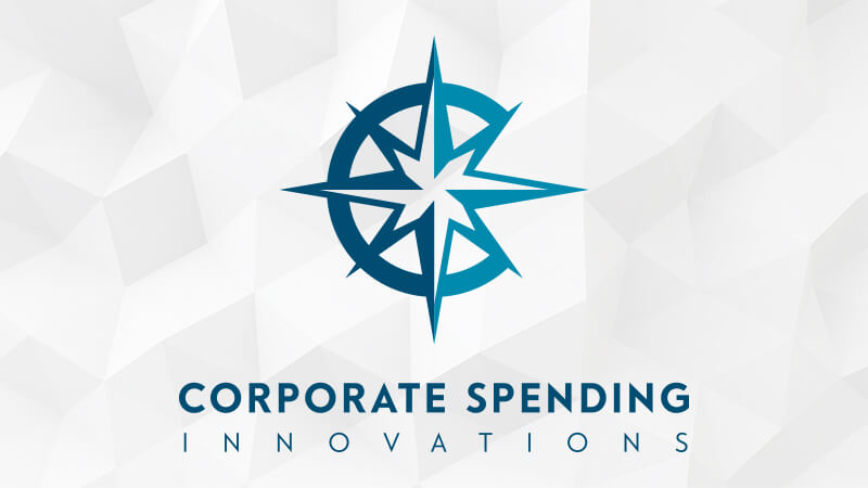
Ultimately, the compass rose surfaced as a concept that would serve our company well. It has universal appeal; every map across the world recognizes the compass rose as a symbol of direction and navigation. As a logo, we saw it telling the story of CSI as a leader and navigator in a competitive sea of B2B payment solutions.
The Plan
Once the decision about the new logo was decided, we realized how much work we had ahead of us. Our messaging across all media platforms, websites, and marketing collateral was 28 years in the making. There were g’s and globalVCard logos everywhere. It wasn’t just external facing; we knew it was going to require a huge internal push as well.
Good communication between teams and a solid plan became the crux of our success. Everything started and stopped with solid project management and a dedicated rock star in charge of assigning deadlines built around the entire creative process, including a hierarchy of reviews and edits.
THE EXECUTION
Internal Reveal
The first step was the internal brand reveal. We wanted to make sure that all internal staff knew, understood, and were on board with the full story behind the rebrand before we did a public launch.
Company cohesiveness and proactively anticipating client, partner, and vendor questions was very important. The executive team handled this aspect by establishing internal support and building anticipation verbally among staff.
External Reveal
Meanwhile, the marketing department initiated an external facing pre-launch teaser campaign that included social media posts and eblasts.
It was important that our external outreach include messaging about our reasons for rebranding while simultaneously reassuring our clients, partners, and vendors that everything they had grown to love about us, including our simple user-interface and secure payment options, would not be changing. We would still be delivering the same great service and products, just looking a lot more attractive while doing it.
Our external reveal happened in two phases, the first being at our annual advisory board meeting, and the second unfolding via digital and social media campaigns to the public. We also deployed a national press release which gave transparency to our rebranding goals and again reassured everyone that nothing other than our look would be changing.
THE RESULTS
Short-term results
The initial reaction to our rebranding has been extremely positive, beginning with our advisory board’s support. We received affirmation from board members that the confusion about who we are and what we offer was immediately lifted. This generated excitement that made our supporters eager to help us get the word out.
Long-term results
Ultimately, our success will be measured based on our ability to expand into new verticals, the continued evolution of our product line, and the overall perceptions and understanding that the public holds of our company.
TOP 4 LESSONS LEARNED
- Content is King. Design is Queen. The perfect marriage between content and design is essential to pulling off this type of repositioning. The copy needed to reflect a modern, witty, sophisticated, and clear voice, and the design needed to shine the brightest light on our key messages with the same integrity. Font, imagery, and layout choices were all equally paramount to ensuring the cohesiveness of our new image.
- Collaborate. Collaborate. Collaborate. Some level of transparency inside the organization needs to be expected. Everything hinges on a fine-tuned and collaborative review process across teams and departments. Getting internal buy-in and making the staff feel included is key to generating support and ensuring streamlined development of new messaging and materials.
- The Show Must Go On. Tackling a company rebrand is a full-time job for everyone, but especially the marketing team. Unfortunately, that doesn’t mean that the day-to-day requirements of normal business operation will cease to be demanding. So, plan for the unexpected, give yourself a realistic timeline, and make sure you stick to your deadlines.
- What Light? What Tunnel? The light at the end of the tunnel never really gets any closer. Even though we’ve made it through the launch, there is still more work to be done. It’s important to know this going in and to plan for the long-haul.
In the end, it has all been worth it and we’re moving full steam ahead with a clearer voice and more modern image that perfectly aligns with our future.